Featured Service: Responsive Design & Development
Simply put, responsive design is a technique used to make a website look great on any size of screen. This means that users on a desktop, laptop, smartphone or tablet would be able to view and experience the website in almost the same way. Since a majority of the population consumes online content via various screen sizes, it only makes sense to continue a seamless user experience in every iteration of a website.
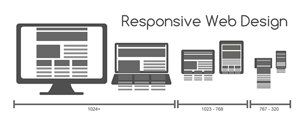
In order for responsive design to work correctly, the site must be broken down in a grid format. Grids help designers visualize how the site will look in various dimensions. These grid foundations also provide the structure for code, telling the site where stopping points are and what size of image or what content formatting to display,
Why Responsive?
Not only does a responsive site give your users a seamless transition from screen to screen, it also saves you money. The standard practice for web developers was to build a full site then a mobile-friendly version. This used to take longer to develop, not to mention the two separate sets of data updates for full and mobile. Now, the industry has embraced the responsive approach. Even Google has stated responsive web design is the best industry practice for search engine optimization, giving the search engine one index to crawl instead of duplicates.
Benefits of Responsive
- User Experience – A responsive site will automatically resize to fit most screens. This means users won’t get frustrated when their experience with your site won’t change when they view it on a different device.
- Reach New Audiences – Increase your reach by serving up content that smartphone and tablet users can easily view and interact with.
- Return on Investment – Businesses save money when only one site would need to be build instead of multiple ones to fit each device.
- Save Time – Instead of building or managing multiple versions of a site, there would only be one to worry about.
- Search Engine Optimization – SEO is improved as there is only one instance of a website instead of multiple versions.
Need a “responsive revamp” of your website? Call us know or fill out our contact form to find out more about what Stanton Street can do for you!

Naomi Dhillon is an Account Manager/Multimedia Specialist at Stanton Street, a web design and development company in El Paso, TX. Naomi has worked at Stanton Street since 2010 and has over 25 years of project and client management experience in the multimedia realm.
About Stanton Street
We help organizations amplify their online presence by building engaging websites, creating successful digital marketing campaigns, and tackling the $%^#/, so they can build their brand, grow their business, and reach their full potential.